Getting Started
This tutorial will show some examples of how to make solar and stellar light
curves using shocksgo.
Generating a Solar Light Curve
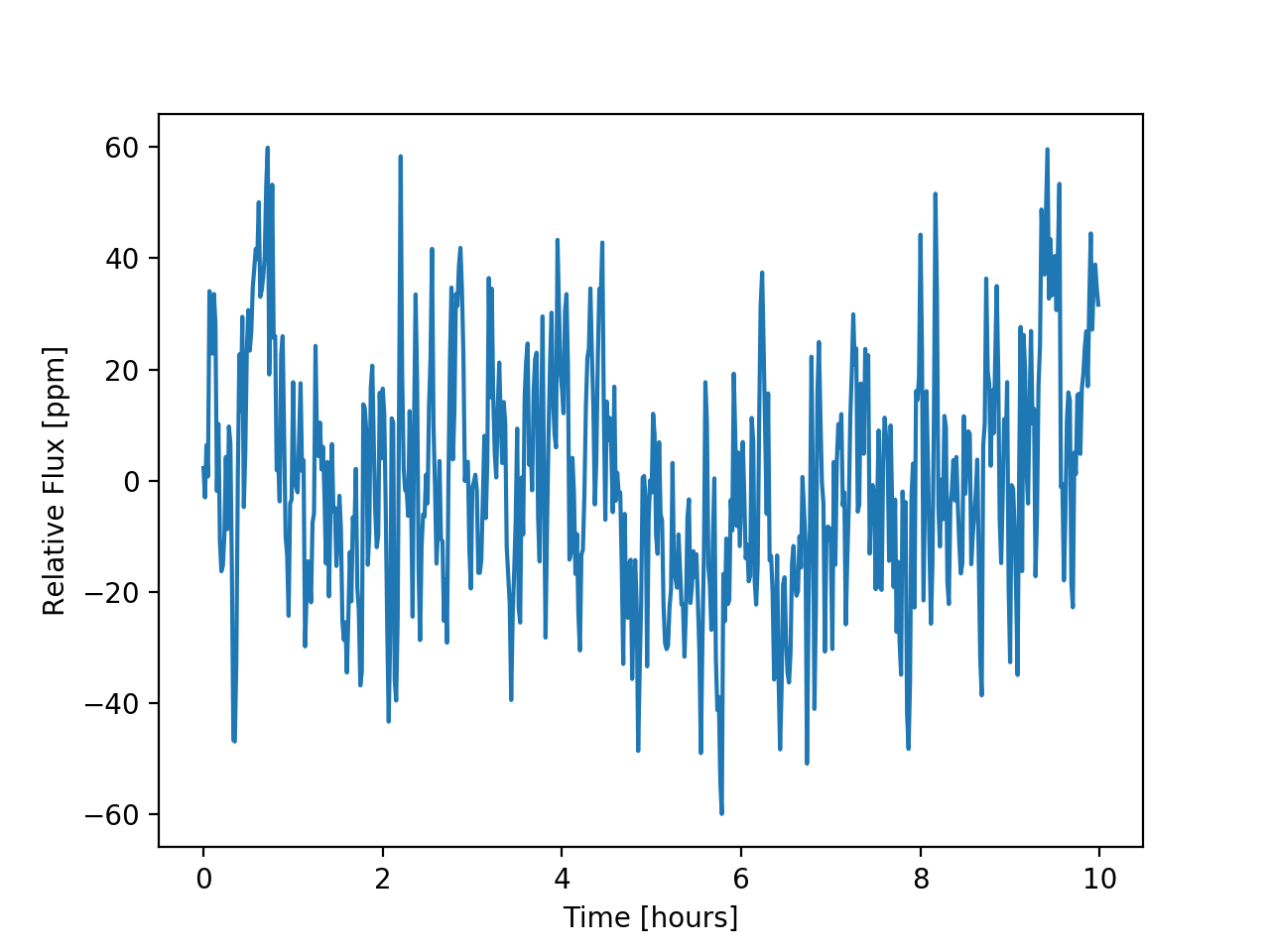
To generate a sample of ten hours of solar fluxes at 60 second cadence, we can use
generate_solar_fluxes:
import matplotlib.pyplot as plt
import astropy.units as u

from shocksgo import generate_solar_fluxes

times, fluxes, kernel = generate_solar_fluxes(duration=10*u.hour, cadence=60*u.s)

plt.plot(times.to(u.hour), 1e6 * fluxes)
plt.gca().set(xlabel='Time [hours]', ylabel='Relative Flux [ppm]')
plt.show()
(Source code, png, hires.png, pdf)

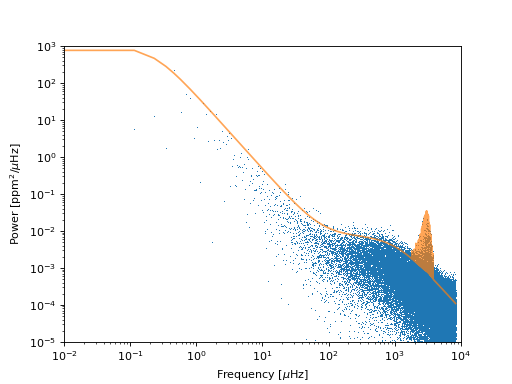
We can check that the power spectrum of the fluxes that we’ve generated reproduce the solar power spectrum:
import matplotlib.pyplot as plt
import numpy as np
import astropy.units as u

from shocksgo import generate_solar_fluxes, power_spectrum

times, fluxes, kernel = generate_solar_fluxes(duration=100*u.day, cadence=60*u.s)

freq, power = power_spectrum(fluxes, d=60)

plt.loglog(freq * 1e6, power, ',', label='Samples')
plt.loglog(freq * 1e6, 1e6 * kernel.get_psd(2*np.pi*freq)/(2*np.pi), alpha=0.7, label='Kernel')
plt.ylim([1e-5, 1e3])
plt.xlim([1e-2, 1e4])
plt.gca().set(xlabel='Frequency [$\mu$Hz]', ylabel='Power [ppm$^2$/$\mu$Hz]')
plt.show()
(Source code, png, hires.png, pdf)

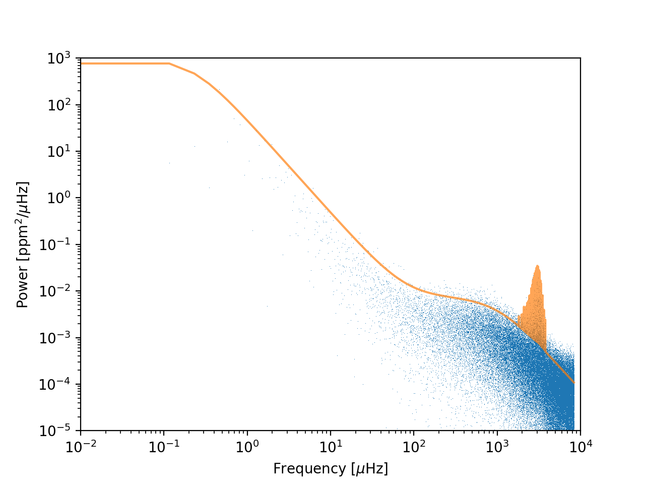
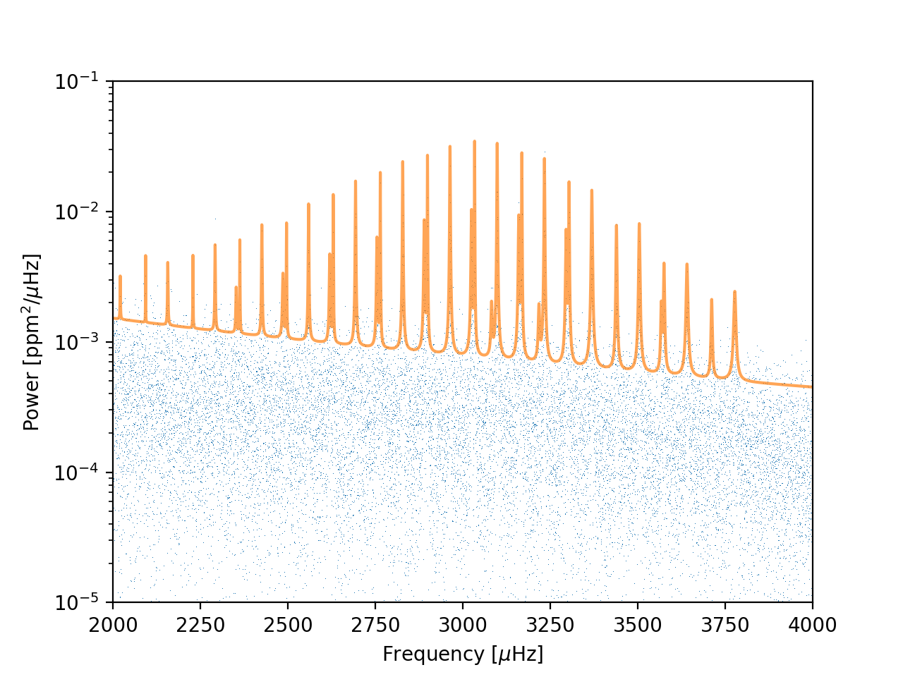
Zooming into the p-mode oscillations, we can see the peaks are reproduced:
(Source code, png, hires.png, pdf)

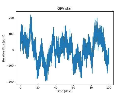
Generating a Stellar Light Curve
To generate a sample of steller fluxes at 60 second cadence, we can use
generate_stellar_fluxes:
import matplotlib.pyplot as plt
import astropy.units as u
from astropy.constants import M_sun, L_sun, R_sun

from shocksgo import generate_stellar_fluxes

# Stellar properties
M = 0.9 * M_sun
T_eff = 5340 * u.K
L = 0.56 * L_sun
R = 0.7 * R_sun

times, fluxes, kernel = generate_stellar_fluxes(duration=100*u.day, M=M, T_eff=T_eff, R=R, L=L, cadence=60*u.s)

plt.plot(times.to(u.day), 1e6 * fluxes)
plt.gca().set(xlabel='Time [days]', ylabel='Relative Flux [ppm]', title='G9V star')
plt.show()
(Source code, png, hires.png, pdf)
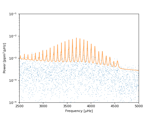
We can see the shift in the p-mode oscillations relative to the solar ones above if we plot the power spectrum:
import matplotlib.pyplot as plt
import numpy as np
import astropy.units as u
from astropy.constants import M_sun, L_sun, R_sun

from shocksgo import generate_stellar_fluxes, power_spectrum

# Stellar properties
M = 0.9 * M_sun
T_eff = 5340 * u.K
L = 0.56 * L_sun
R = 0.876 * R_sun

times, fluxes, kernel = generate_stellar_fluxes(duration=10*u.day, M=M, T_eff=T_eff, R=R, L=L, cadence=60*u.s)

freq, power = power_spectrum(fluxes, d=60)

plt.semilogy(freq * 1e6, power, ',', label='Samples')
plt.semilogy(freq * 1e6, 1e6 * kernel.get_psd(2*np.pi*freq)/(2*np.pi), alpha=0.7, label='Kernel')
plt.ylim([1e-5, 1e-1])
plt.xlim([2500, 5000])
plt.gca().set(xlabel='Frequency [$\mu$Hz]', ylabel='Power [ppm$^2$/$\mu$Hz]')
plt.show()
(Source code, png, hires.png, pdf)
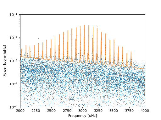
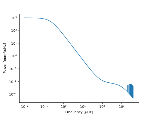
Custom Frequencies
Suppose you have a list of model p-mode frequencies, and you would like to
generate a light curve from your custom list of frequencies (without scaling
from the solar values). You can do so using a different set of keyword arguments
in the generate_stellar_fluxes function, like so:
import numpy as np
import matplotlib.pyplot as plt
import astropy.units as u
from astropy.constants import R_sun, M_sun, L_sun
from shocksgo import generate_stellar_fluxes
M = 1*M_sun
L = 1*L_sun
T_eff = 5777 * u.K
R = 1*R_sun
freqs = np.linspace(2000, 4000, 10) # in microHertz
log_amps = np.exp(-0.5 * (freqs - 3000)**2 / 1000**2) - 32
log_lifetimes = np.ones_like(freqs) * 7
duration = 2 * u.min
times, fluxes, kernel = generate_stellar_fluxes(duration, M, T_eff, R, L,
frequencies=freqs,
log_amplitudes=log_amps,
log_mode_lifetimes=log_lifetimes)
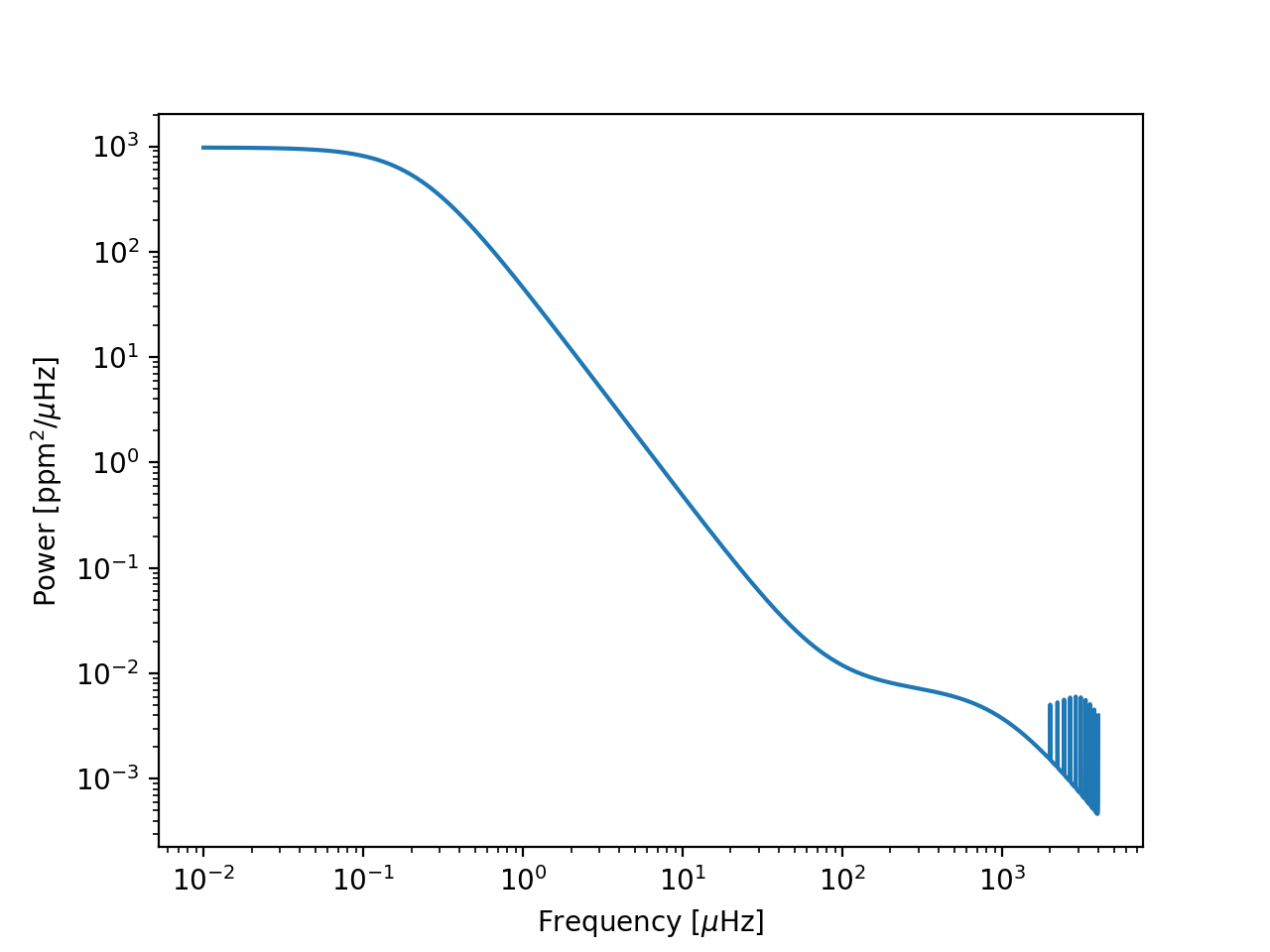
test_freqs = np.logspace(-2, np.log10(freqs.max()), 1e6)
plt.loglog(test_freqs, 1e6/(2*np.pi) * kernel.get_psd(2*np.pi*test_freqs*1e-6))
plt.gca().set(xlabel='Frequency [$\mu$Hz]', ylabel='Power [ppm$^2$/$\mu$Hz]')
plt.show()
(Source code, png, hires.png, pdf)
